
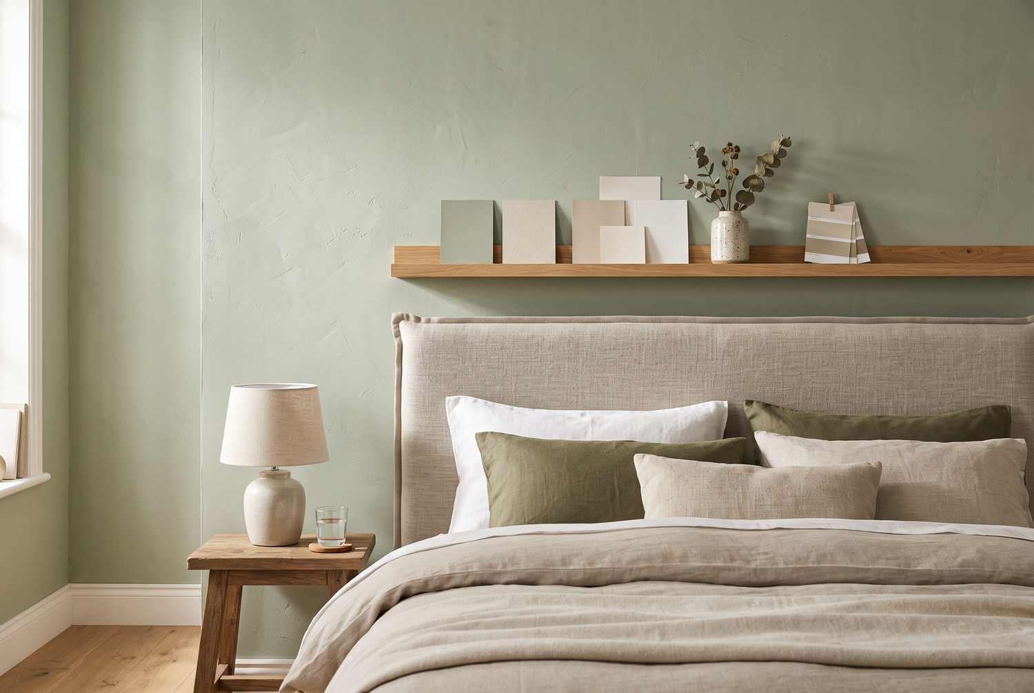
Wall color is the largest design element in the bedroom; it surrounds you across 30 to 50 square meters and influences the room's mood more than any piece of furniture. Nevertheless, it is often chosen based on catalog trends rather than its effect on sleep. While research on color psychology is not perfect, it is clear enough for definitive recommendations: muted, desaturated tones lower arousal levels, while bright and highly saturated colors keep you awake. The right wall color in the bedroom costs no more than the wrong one, but you will feel its effect every evening. In this article, you will learn which colors have proven effective, which you should avoid, how brightness and room orientation interact, and practical tips for painting, including the question of low-emission paints.
The short answer: Muted, desaturated tones are best for restful sleep: soft blue, sage or grey-green, warm sand and greige tones, and delicate terracotta. They lower visual arousal and make the room appear calm. You should avoid strong red, bright orange, vivid yellow, and highly saturated colors in general, as well as cold, pure white in large areas. Choose matte colors with a high light reflectance value for dark rooms and test every shade with a sample coat in evening light.
- Muted blue and green are considered the most calming bedroom colors in surveys and color psychology, followed by warm natural tones.
- The saturation is more crucial than the hue: pale, broken shades calm, while vibrant tones activate.
- Matte finishes absorb reflections and appear calmer than glossy ones; always use matte paint in the bedroom.
- North-facing rooms can benefit from warm tones (sand, greige, terracotta), while south-facing rooms can also handle cooler blue and green tones.
- Choose low-emission paints (e.g., with an eco-label) and ventilate thoroughly for at least 2 to 3 days after painting before sleeping in the room.
How wall colors affect body and psyche
Colors affect sleep in two ways. The direct way is physiological: Highly saturated, bright color stimuli are proven to increase the activation level of the nervous system, measurable by pulse and skin conductivity, while muted, darker environments allow the body to calm down. The indirect way is psychological: colors carry learned meanings; blue stands for sky, water, and vastness; green for nature and security; red for alarm and energy. Both effects accumulate in the evening when the brain is already looking for signals whether it can shut down. A frequently cited British survey of tens of thousands of households found the longest reported sleep times in blue, green, and yellowish-warm bedrooms, and the shortest in purple, brown, and grey. Such surveys should be treated with caution methodologically but align with experimental color psychology in their general direction. Important to know: the effect primarily occurs in light, i.e., in the evening when going to bed and in the morning when waking up; at night in the dark, the wall color is naturally invisible.
The best color families for the bedroom
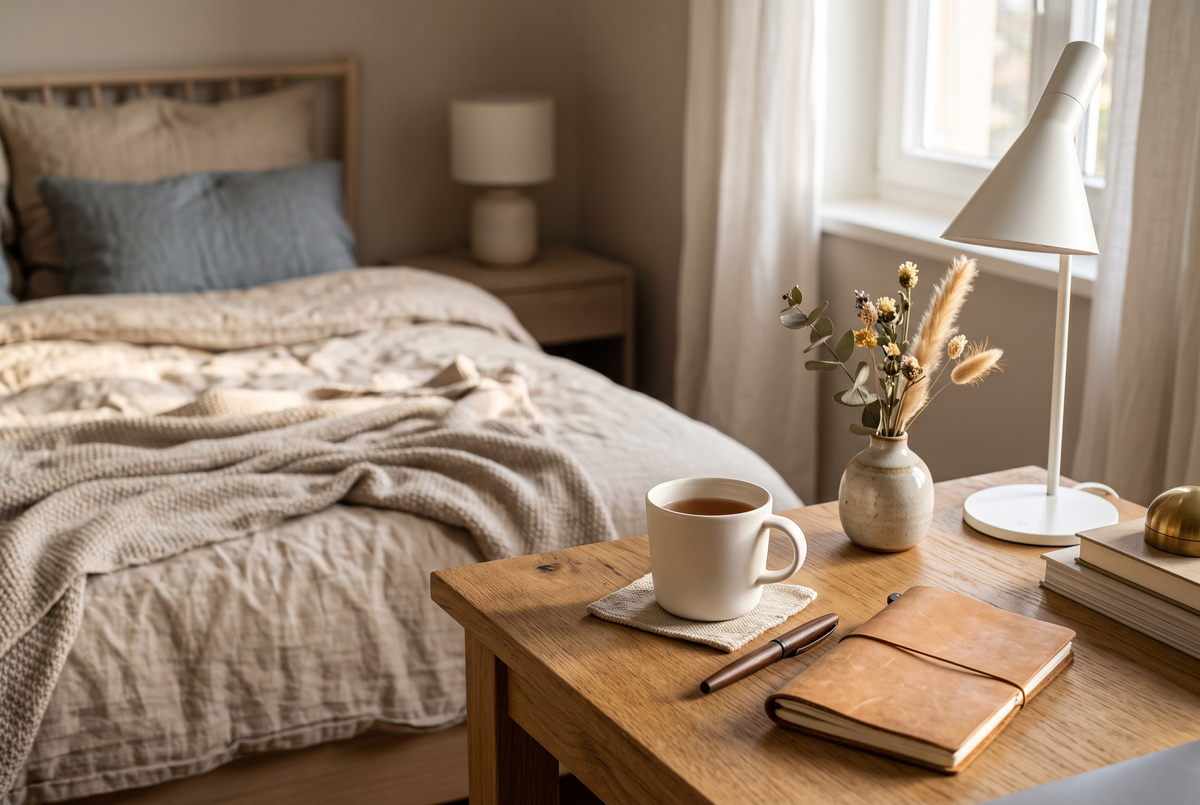
Blue is a classic: a light dove blue or a muted grey-blue has a cooling, expansive, and organizing effect, ideal for rooms that quickly appear cluttered. Green, especially sage, eucalyptus, and grey-green, combines tranquility with warmth and harmonizes perfectly with wooden furniture and linen textiles—it's no coincidence that it has been the most popular bedroom color in Scandinavian-decorated homes for years. Warm neutral tones, sand, cream, greige, and light taupe, are the safest choice: they soothe without appearing cool and suit any interior style. Delicate terracotta and broken pink tones (such as a dusty old rose) bring comfort to north-facing, cold rooms. Dark tones can also work: a deep grey-green or midnight blue on the wall behind the headboard creates a cave-like sense of security but should be limited to an accent wall so that the room does not feel oppressive. For how colors and furnishings interact according to Far Eastern teachings, read the complementary article on Feng Shui in the bedroom.

Colors at a glance: effect and suitability
| Color Family | Effect | Suitable for |
|---|---|---|
| Muted Blue | Cooling, organizing, calming | Bright, south-facing, or warm rooms |
| Sage/Grey-Green | Balancing, natural, warm | Almost all rooms, especially with wood and linen |
| Sand/Greige/Taupe | Calm, unobtrusive, timeless | Safe choice for any room and style |
| Delicate Terracotta/Old Rose | Cozy, warming | Cool north-facing rooms, large rooms |
| Dark Midnight Blue/Forest Green | Cave-like, intimate, elegant | Only as an accent wall behind the headboard |
| Strong Red/Orange/Yellow | Activating, appetite- and pulse-increasing | Better avoid in the bedroom |
Properly combining brightness, saturation, and room orientation
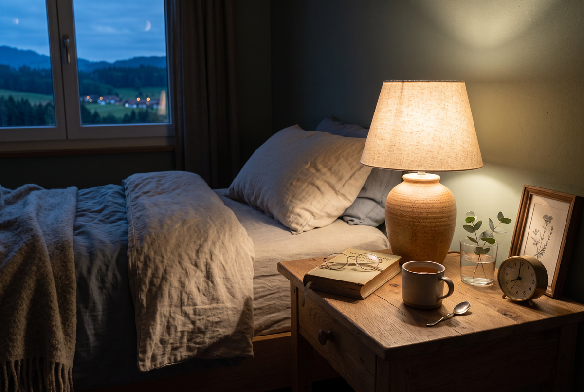
Two technical parameters help with selection more than any trend name. First, saturation: the purer and brighter a tone, the more activating its effect. Therefore, choose shades with a visible admixture of grey or white, referred to in specialized paint shops as "broken" or "dusty" tones. Second, the Light Reflectance Value (LRV), which indicates how much light a color reflects, from 0 (black) to 100 (white): For small or dark bedrooms, an LRV of 60 to 80 is recommended so that the room does not become gloomy; in large, bright rooms, 30 to 50 may also be suitable. The room's orientation determines the color's temperature: north light is cool and quickly makes blue tones appear frosty; here, sand, greige, and terracotta add warmth; south and west-facing rooms with warm evening light, on the other hand, particularly tolerate cool blue and green tones well. And because color only exists with light, lighting must be planned along with it: warm white lamps with 2700 Kelvin make almost every muted tone appear calm in the evening. More on this in the guide to bedroom lighting.
Common mistakes in color selection
Mistake 1: Choosing paint at the hardware store under neon light. Every shade looks different at home; always paint a test patch of at least 50 by 50 cm on the target wall and evaluate it in the morning, at noon, and in the evening under lamp light. Mistake 2: Painting all four walls in a dark shade. What looks dramatic in interior photos can overwhelm small rooms; dark shades belong on the accent wall, usually behind the headboard, where they are not in view when lying down. Mistake 3: Using glossy paint. Sheen levels from satin finish reflect light sources and create restless reflections; in the bedroom, dead flat matte is the right choice. Mistake 4: Underestimating saturation. A "cheerful" yellow or turquoise may seem harmless on a sample card but quickly becomes glaring on 15 square meters of wall; when in doubt, always choose the paler shade. Mistake 5: Ignoring pollutants. Freshly painted rooms emit volatile compounds; choose low-emission, solvent-free paints with a recognized eco-label and ventilate thoroughly for 2 to 3 days after painting before sleeping in the room again. Similar care is worthwhile for all materials in the sleeping area, as shown in the article on sustainable bedrooms.

Get CHF 25 discount
Subscribe to newsletter and receive a one-time CHF 25 discount. ✓ 200 nights trial sleep ✓ 10 years warranty
Practice: Painting the bedroom in five steps
Step 1: Narrow down color choices. Select two to three candidates from the calming color families and have sample pots mixed; this costs little and prevents expensive mispurchases. Step 2: Paint test areas and observe them for 48 hours under various lighting conditions, especially in the evening when you actually use the room. Step 3: Gather materials: dead flat, low-emission interior paint. For a 14 m² bedroom with a 2.4 m ceiling height, estimate about 5 to 7 liters for two coats. Step 4: Paint systematically: first edges and corners, then surfaces, second coat after complete drying (usually 4 to 6 hours). Step 5: Air out and refurnish. Ideally, do not sleep in the room for 2 to 3 days after thorough ventilation. Finally, coordinate textiles; bed linen in natural tones enhances the calming effect. For inspiration, consult the bed linen comparison. This way, you can create a room that signals "calm" as soon as you enter, all in one weekend.
Frequent questions about bedroom wall paint
Which wall color is best for sleep?
Muted, desaturated tones: soft blue, sage or grey-green, and warm sand or greige shades. They lower visual arousal and make the room appear calm; the specific choice depends on light incidence and furnishings.
Which colors should be avoided in the bedroom?
Strong red, bright orange, vivid yellow, and generally highly saturated tones, as they have an activating effect. Cold, pure white in large areas can also appear sterile; broken white and natural tones are more pleasant.
Is a dark wall color in the bedroom bad?
No, a deep midnight blue or forest green can create a very cozy feeling as an accent wall behind the headboard. Painting all four walls dark is only recommended in large, bright rooms; otherwise, the room can quickly feel oppressive.
Matte or glossy: which sheen level belongs in the bedroom?
Dead flat matte. Matte surfaces absorb reflections from lamps and street lights and make colors appear softer. Glossy finishes create restless light points and also highlight every wall imperfection.
How long after painting should you not sleep in the room?
For low-emission paints, at least 2 to 3 days with thorough ventilation, until the typical odor has disappeared. Sensitive individuals, pregnant women, and children should wait a bit longer and choose solvent-free paints with an eco-label from the outset.
Which wall color makes a small bedroom appear larger?
Light tones with a high light reflectance value (about 60 to 80), such as light grey-blue, light sage, or greige. If the ceiling is painted in the same light tone, the room's edges blur, and the room appears optically larger.





Leave a comment
This site is protected by hCaptcha and the hCaptcha Privacy Policy and Terms of Service apply.